DePaul Dance Company Programs
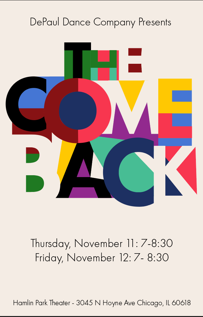
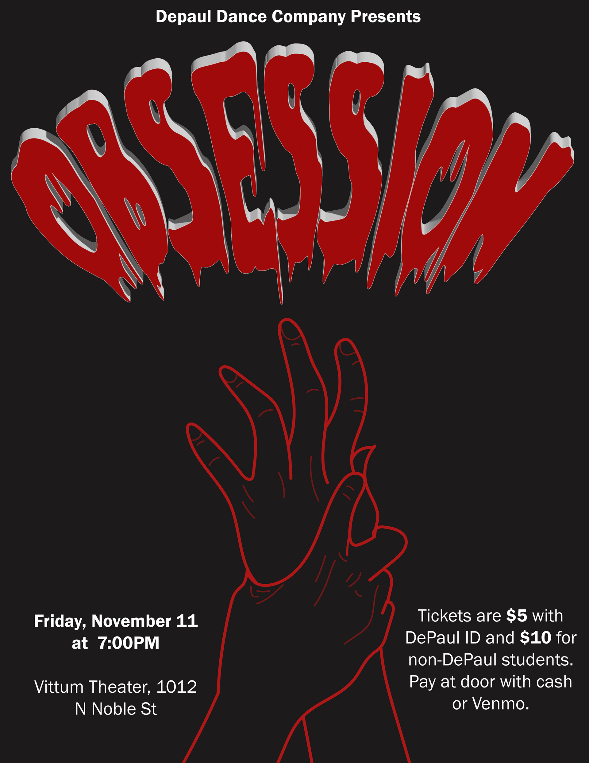
DDC Show Program November 2022
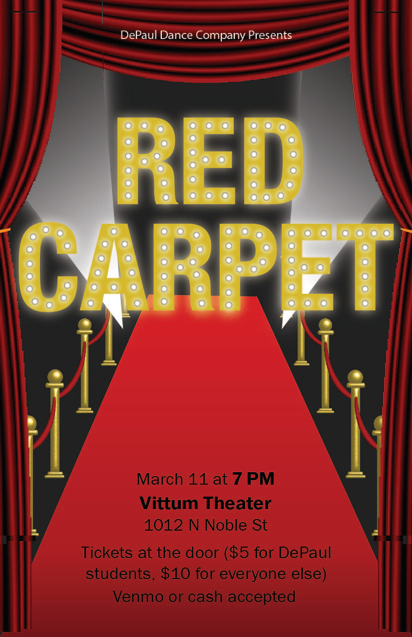
DDC Show Program March 2022
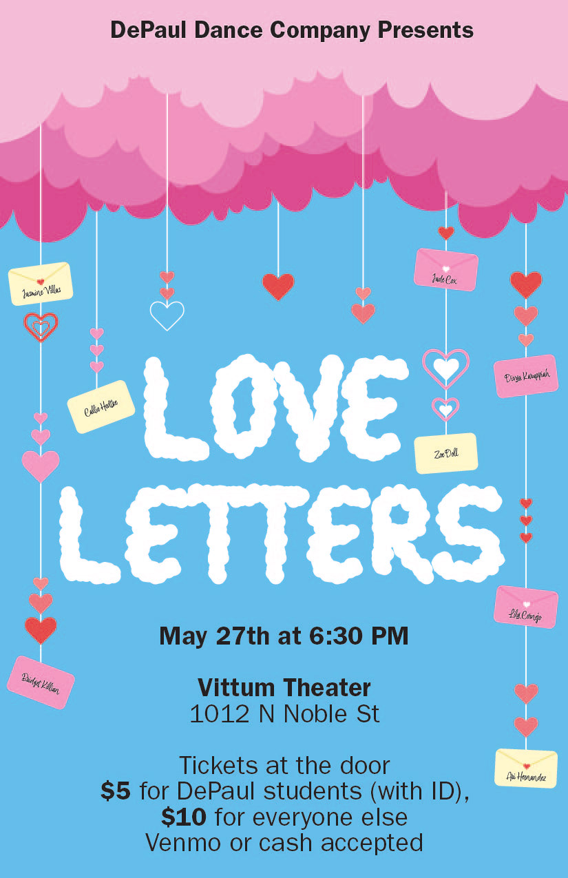
DDC Show Program May 2022
DDC Show Program November 2023
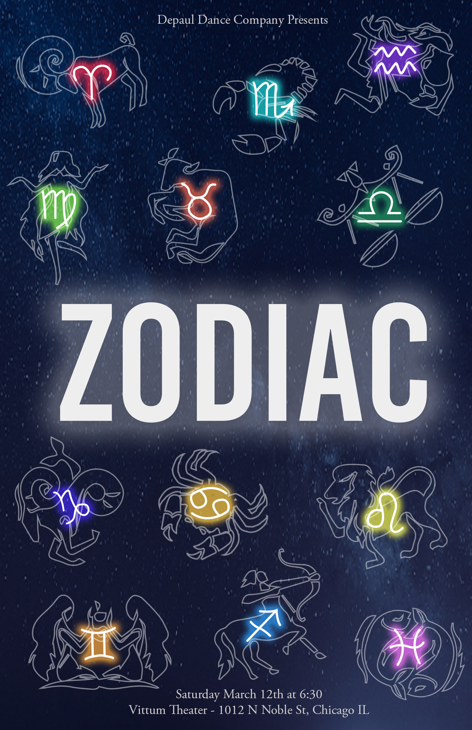
DDC Show Program March 2023
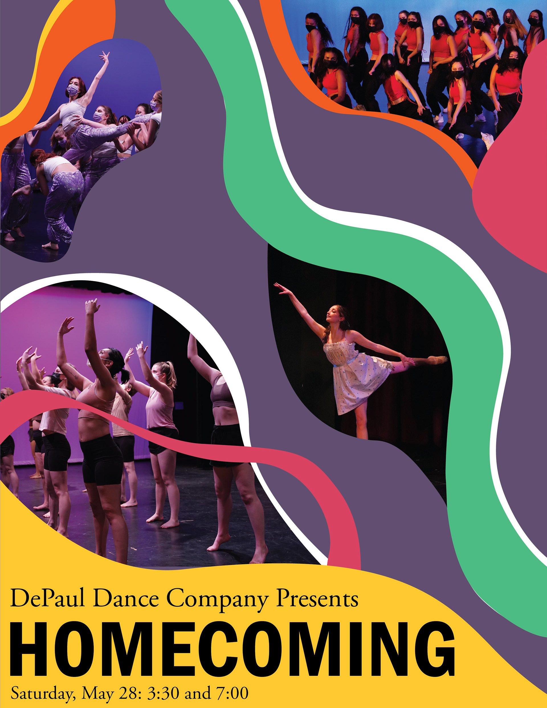
DDC Show Program May 2023
I became the Graphic Designer for my dance company in 2021. Over the course of the next three years, I was in charge of several different design projects, including designing the programs for our shows once we started to have them again in 2022. Each show would have a theme that I would use to conceptualize and create the design that would be used for our promotional materials and program cover. For each show, I tried to utilize a new style and technique in my illustration, photo manipulation, and typography.
Event Posters
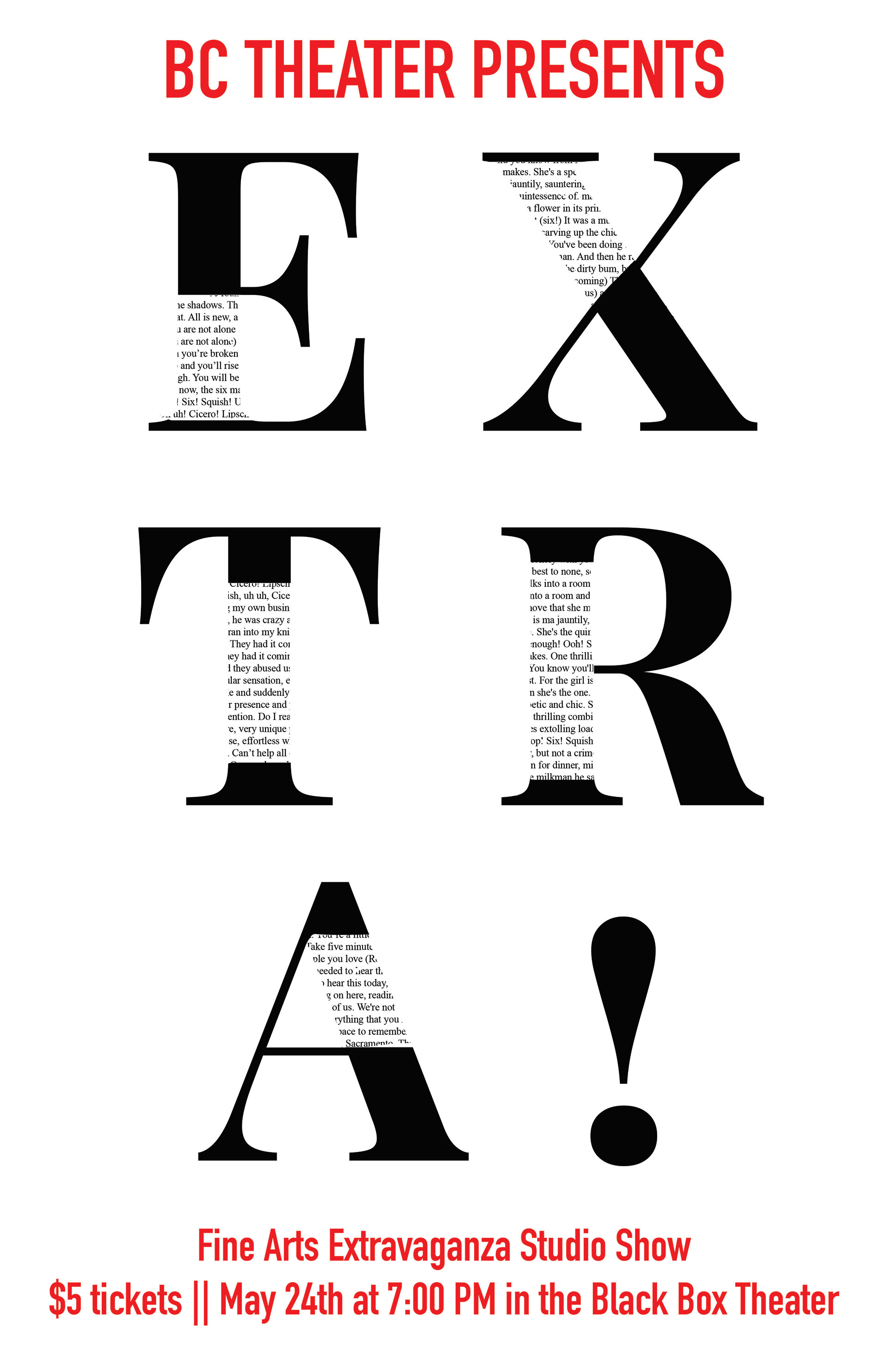
BC Theater Studio Show Poster
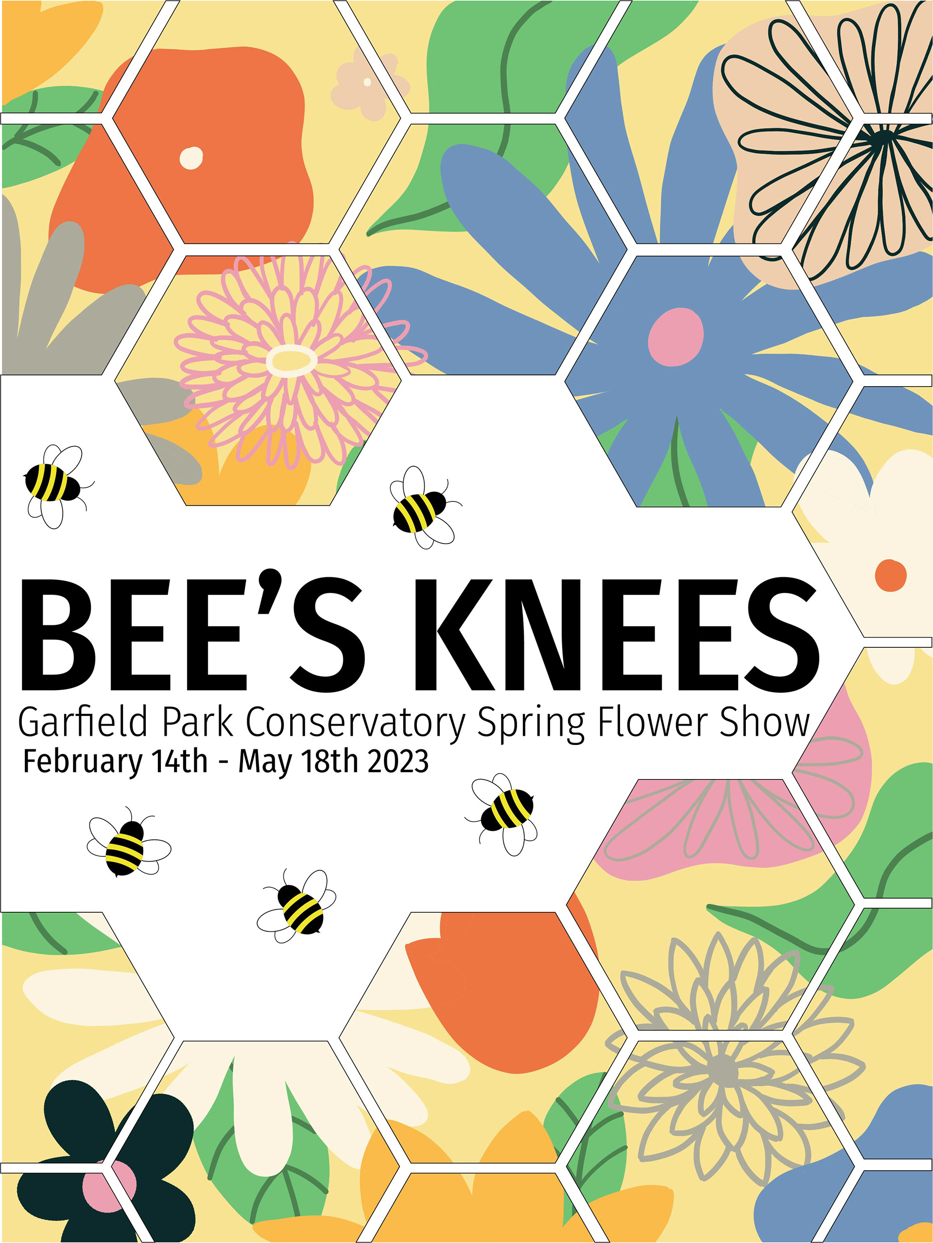
Bee's Knees Event Poster
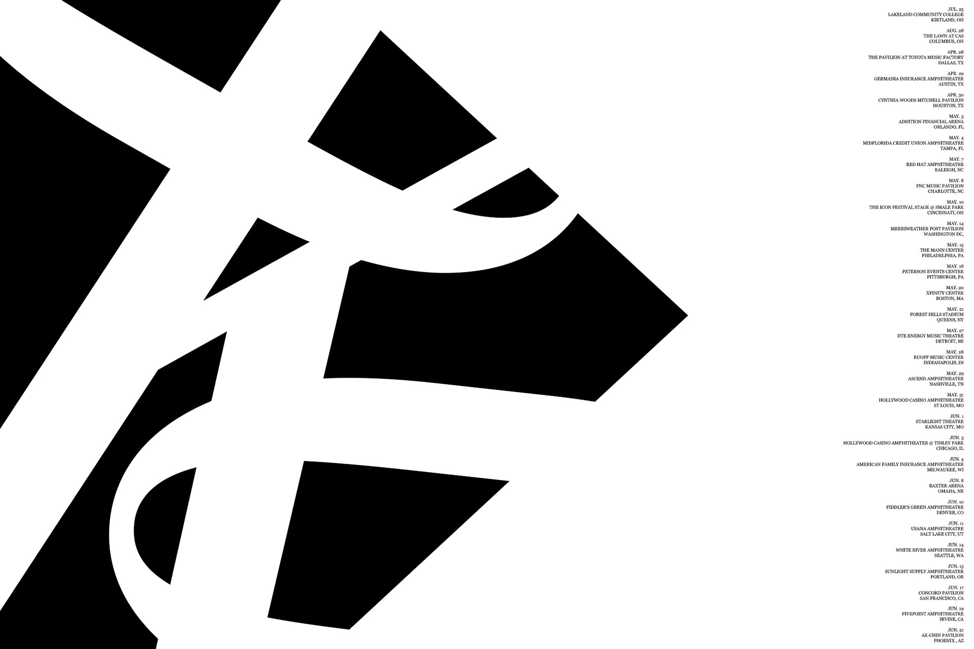
OK Orchestra Tour Event Poster
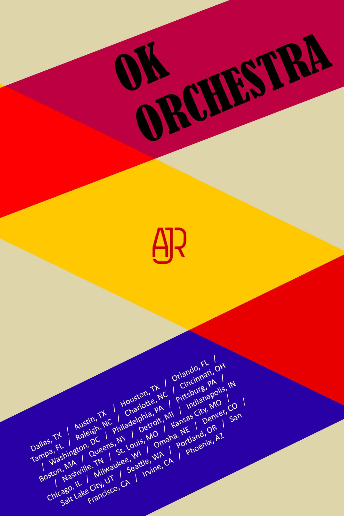
OK Orchestra Tour Event Poster
I have created several different event posters for classes and for real events. I was asked to design the poster for my high school's studio show production which was titled "Extra!". I took inspiration from minimalist design and gave it the feel of a newspaper by working with only type and a very limited color palette. For one of my classes, I was asked to pick an event and design an event poster for it. I chose the Garfield Park Conservatory's Spring Flower Show. My goal was to bring in the name of the event while still visually communicating what the event was about. This led me to my flowery background design inside a honeycomb pattern as a nod to the "Bee's Knees" title. In another one of my classes, I was encouraged to pick an event and design several posters in several different styles. I chose AJR's OK Orchestra tour that I was going to later that year. For one of the posters, I took more retro inspiration while, with the other one, I tried to play with the concept of background and foreground.
Quarantine Booklet
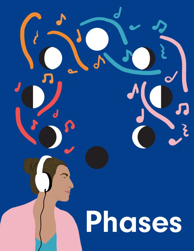
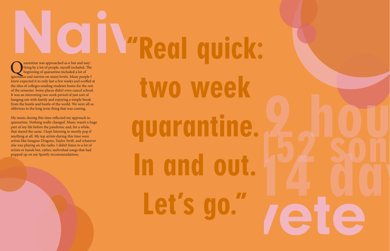
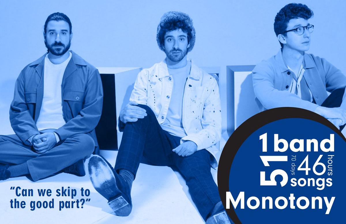
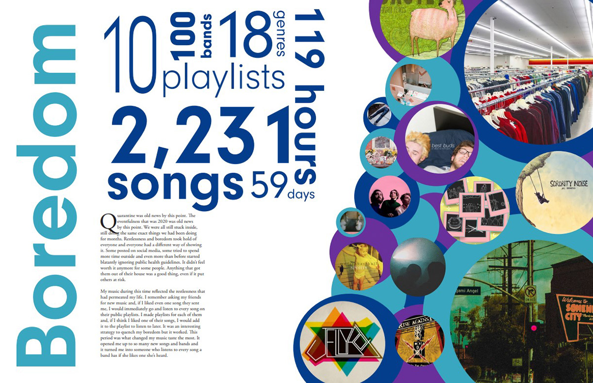
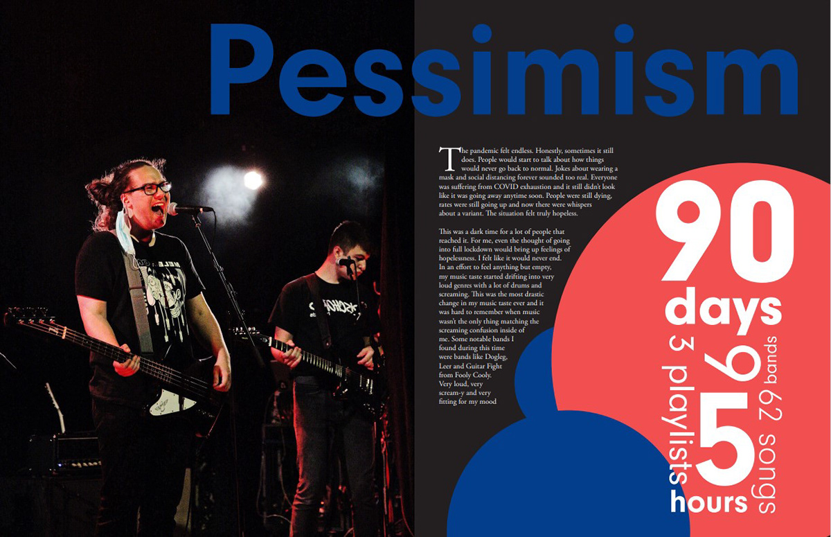
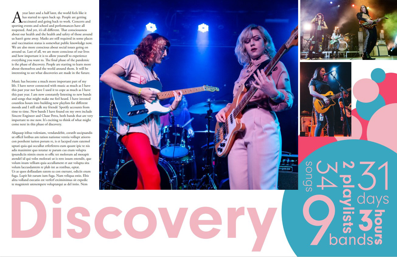
Through this booklet, I wanted to explore the feelings that I had during the height of the COVID-19 pandemic through the lens of music. My music taste and what music itself meant to me changed drastically during this time and it was interesting to chronical my journey through different bands and emotions. Each spread of the booklet explored a feeling or "stage" of the pandemic and how that feeling affected the music that spoke to me the most. I chose to keep a similar style of design on each spread but the color palette and layout changed to reflect the feeling that I was talking about. I also included an information cloud on each page to allow for views to understand my music taste during that time at a glance.
Miscellaneous Posters
These posters are examples of different styles that I have experimented with. Even with the drastically different styles and content, my goal for each poster was to visually communicate the content in a way that was unique but still honored the feel of the material.
Studying the Grid
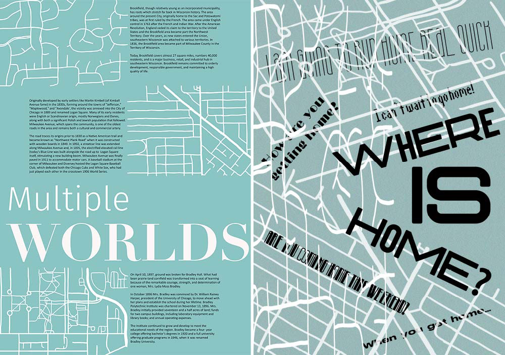
This project was all about designing to a grid versus deconstructing the grid. My teacher also encouraged us to try to convey certain feelings with each poster. I chose to convey the feeling of displacement that comes from moving back and forth between my home in Milwaukee and Chicago. I order to do this, I traced several different maps and included an excerpt about the area for the grid design. When it came time to deconstruct, I focused on stretched text and images along with overlapping the two to communicate the chaos and disorientation that moving several times in a short period of time can bring on.